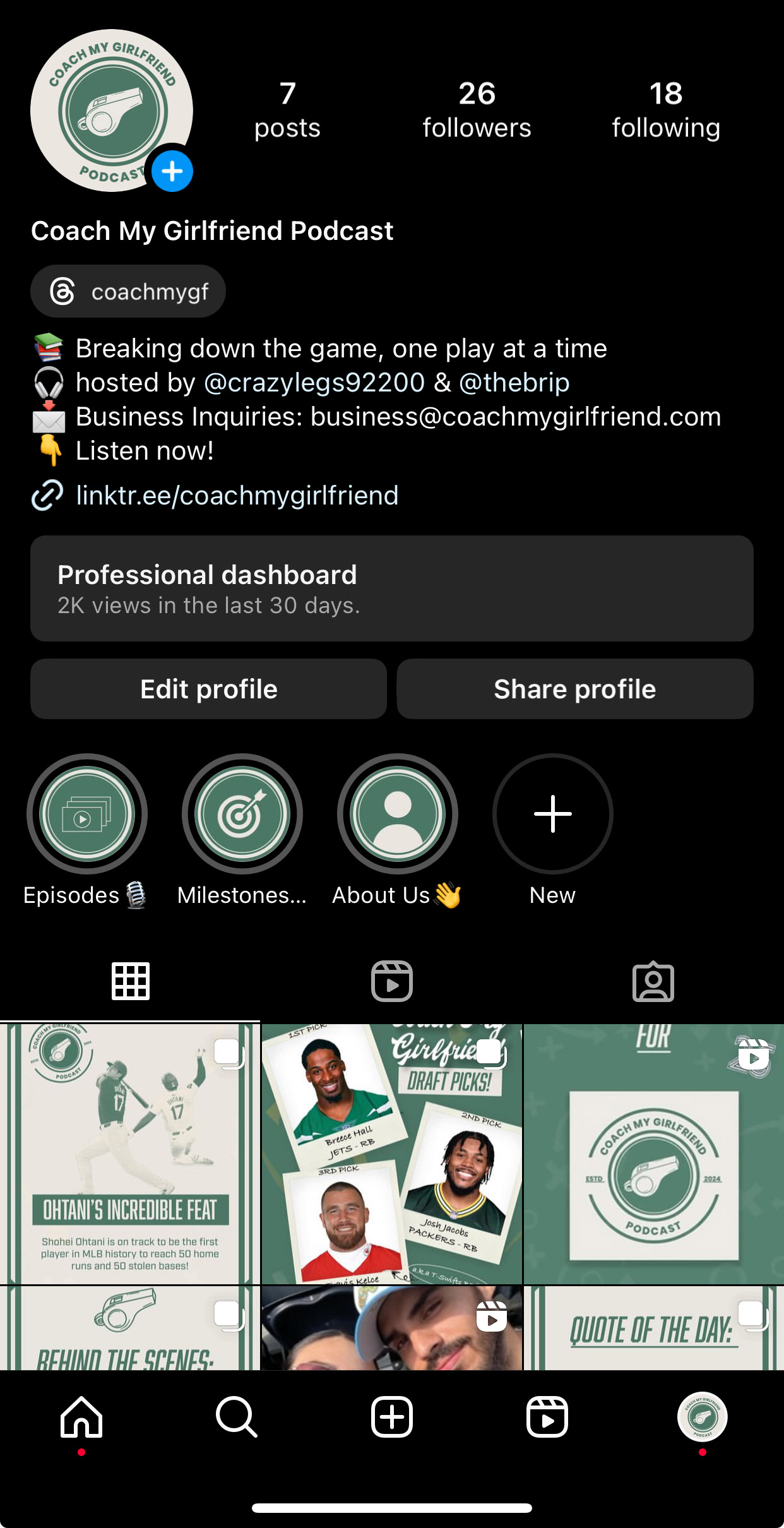
Project Overview
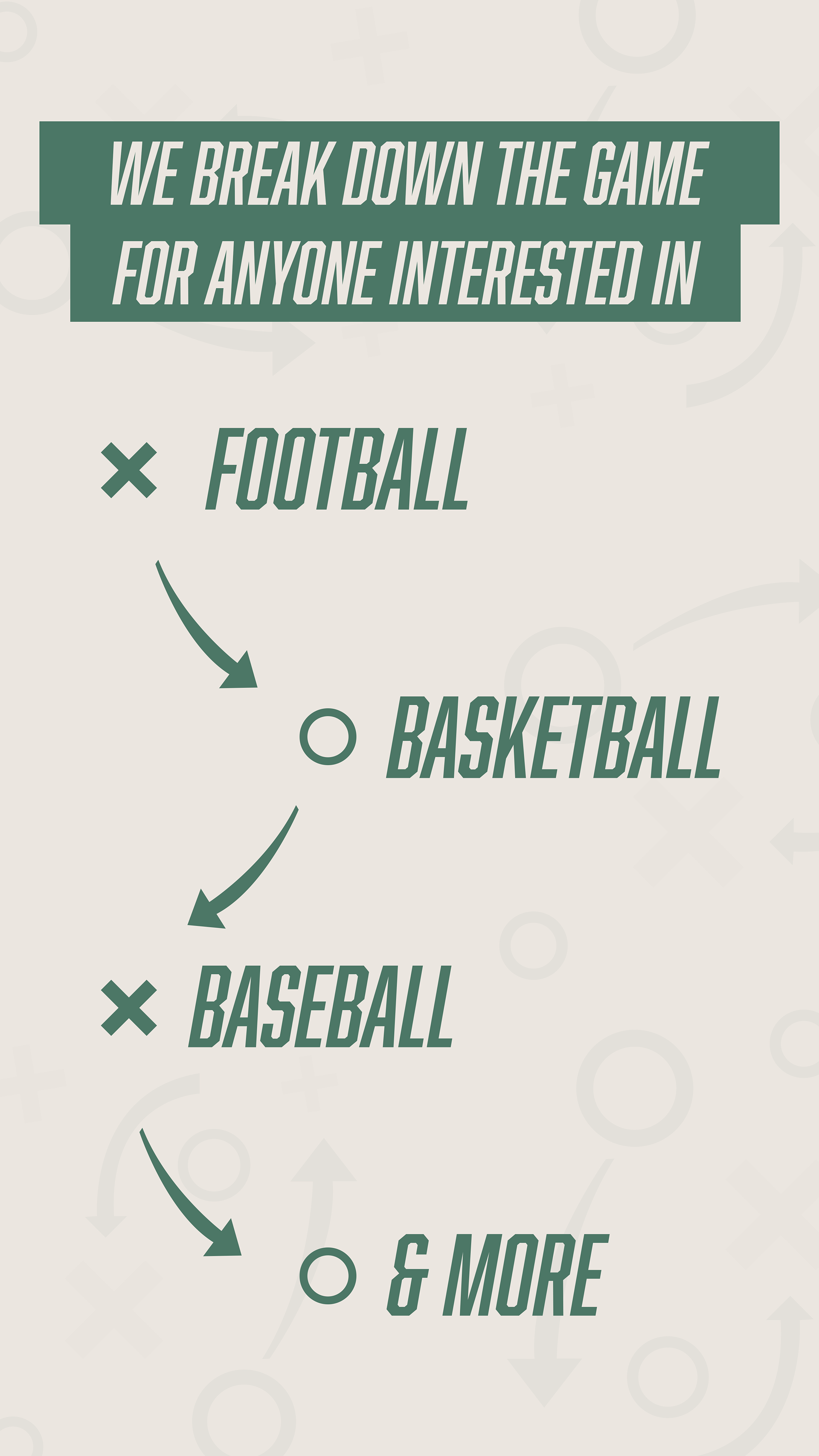
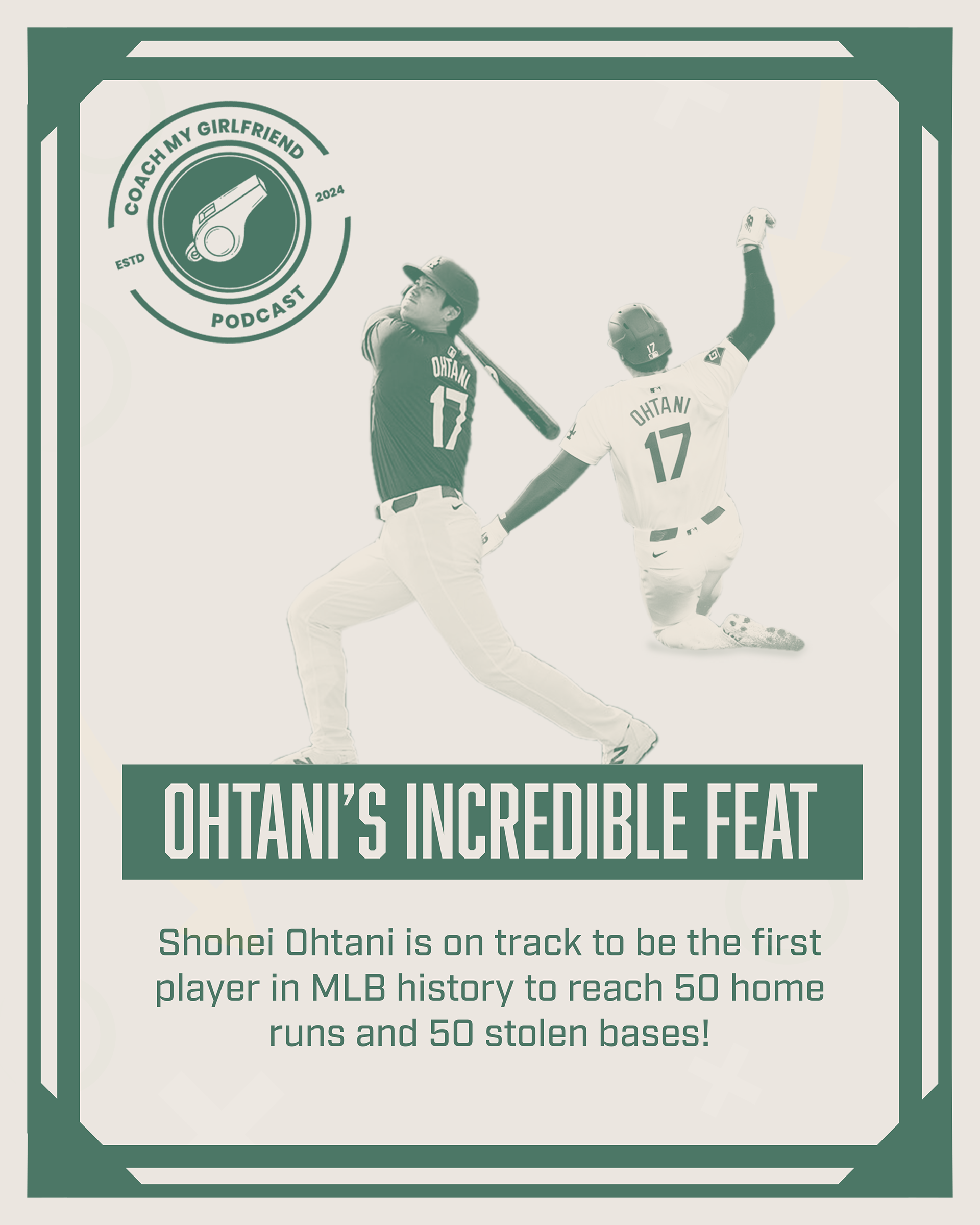
The "Coach My Girlfriend Podcast" focuses on making sports more accessible to beginners and women who want to learn about sports in a fun, engaging way. The goal of the design was to create a visual identity that communicated the casual, approachable tone of the podcast, while staying true to the dynamic and competitive nature of sports.
The "Coach My Girlfriend Podcast" focuses on making sports more accessible to beginners and women who want to learn about sports in a fun, engaging way. The goal of the design was to create a visual identity that communicated the casual, approachable tone of the podcast, while staying true to the dynamic and competitive nature of sports.
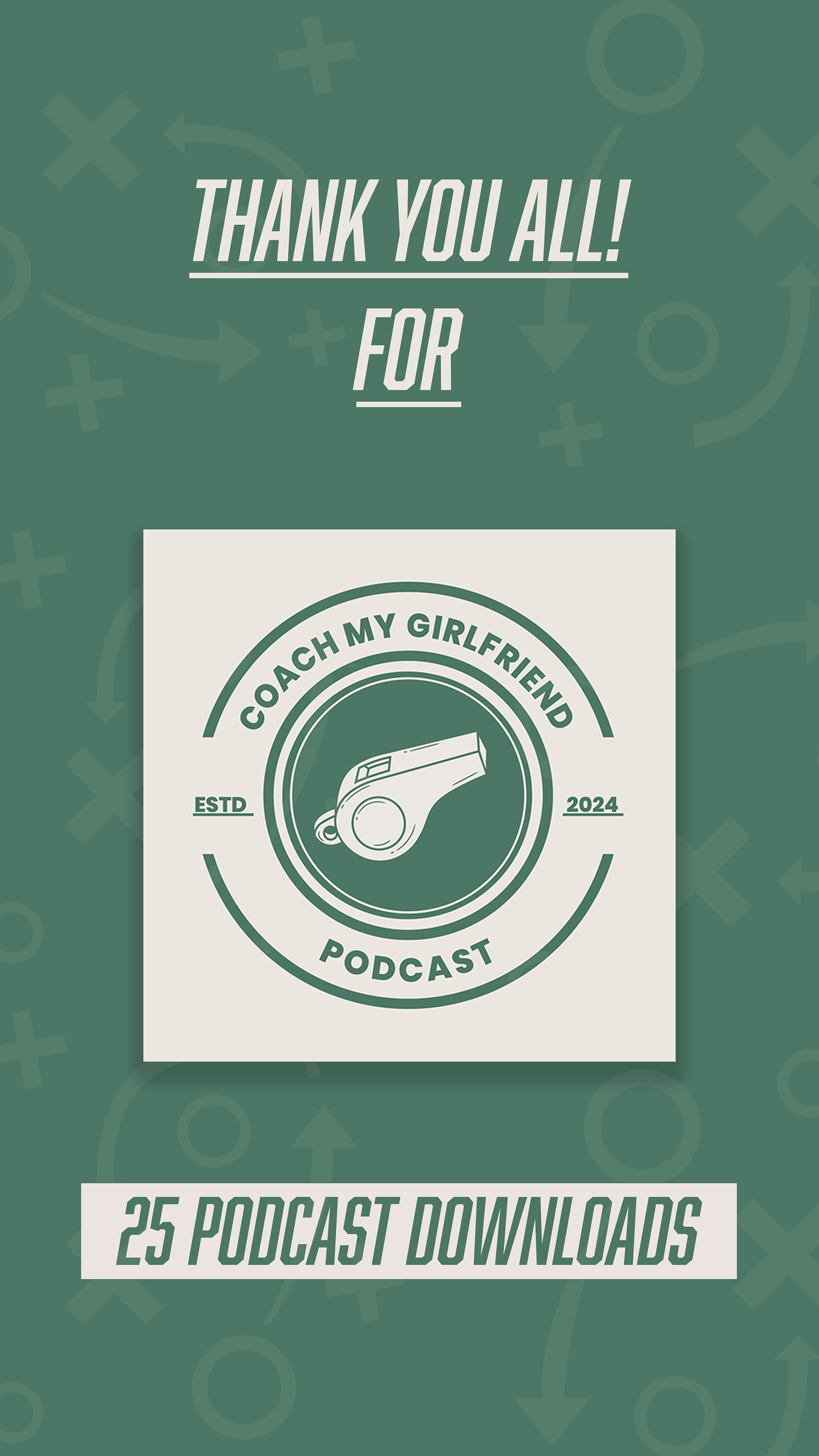
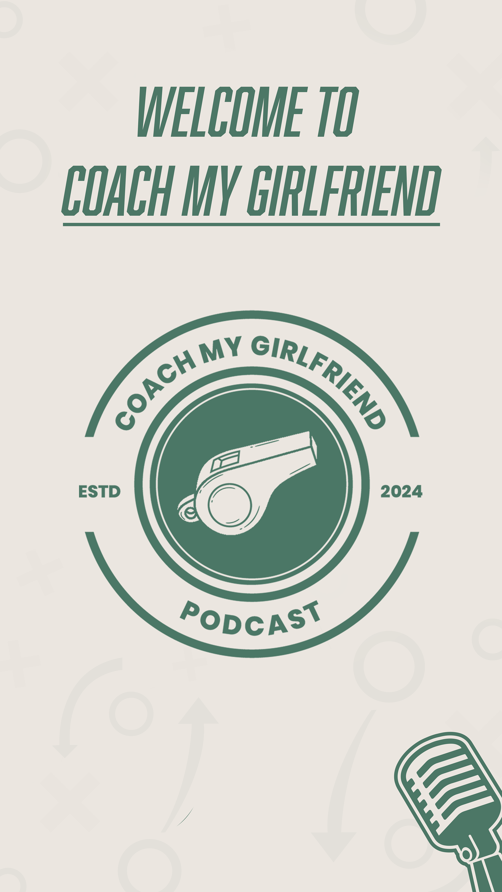
Logo Design
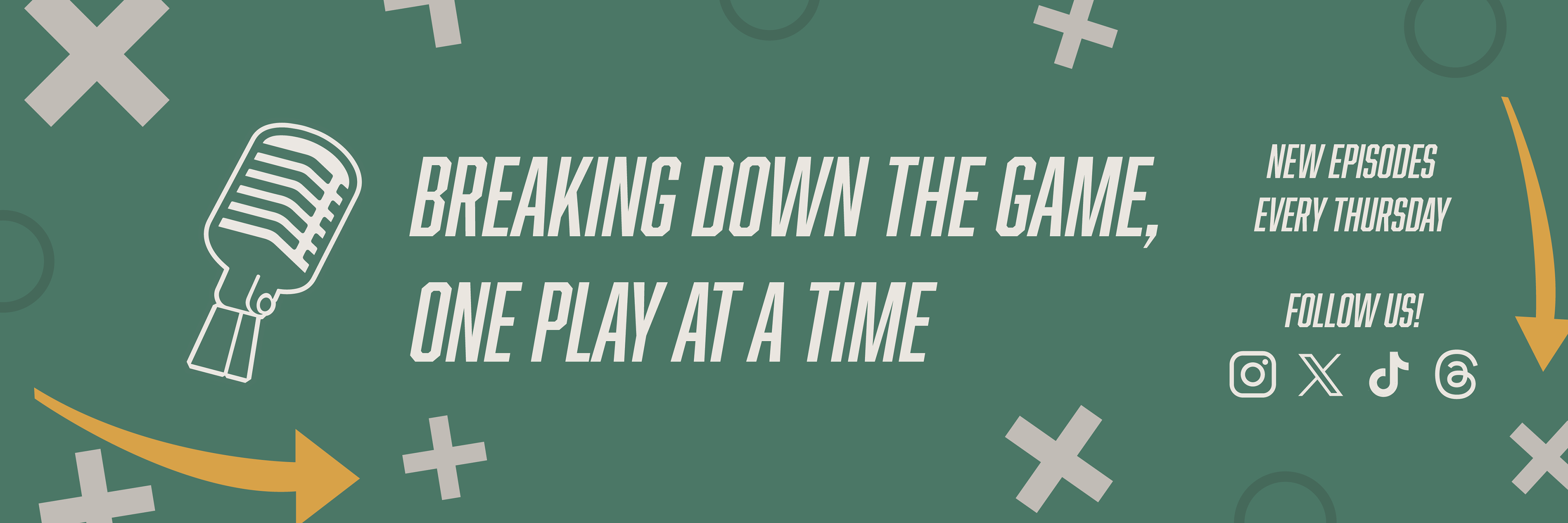
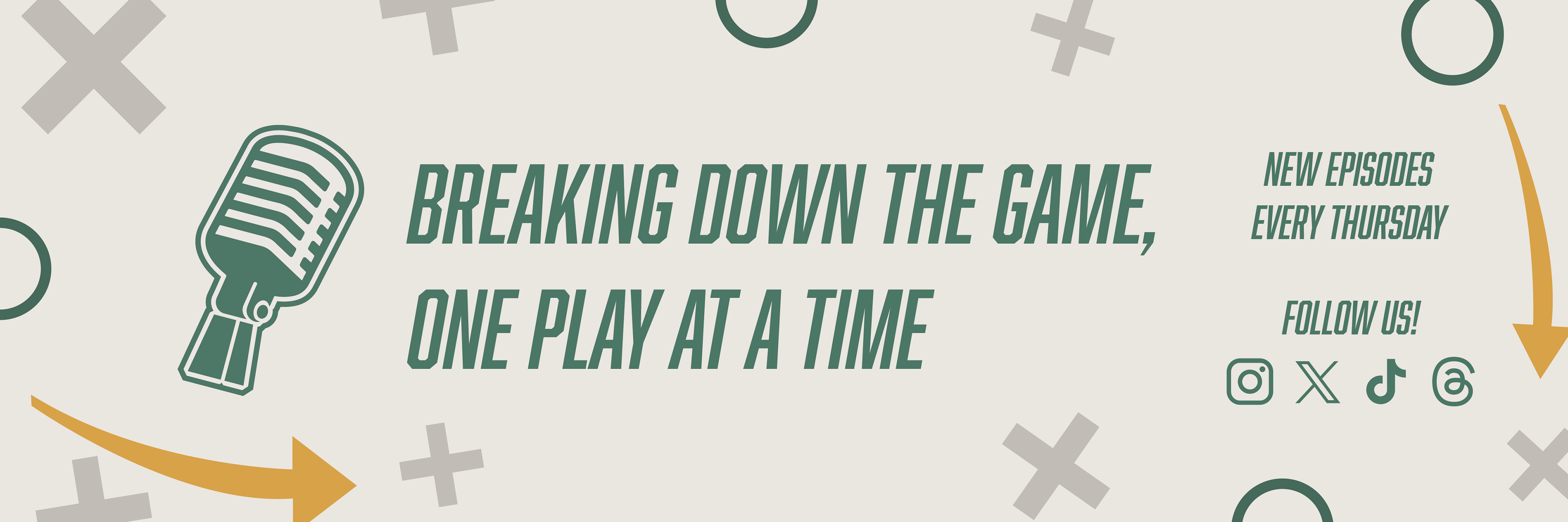
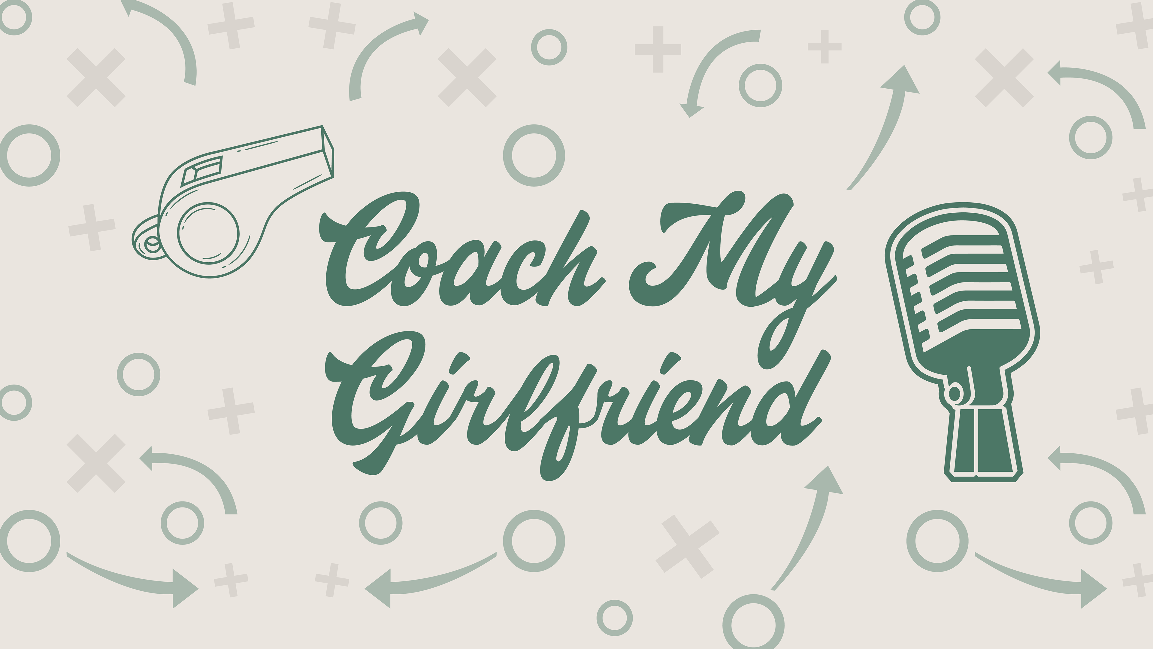
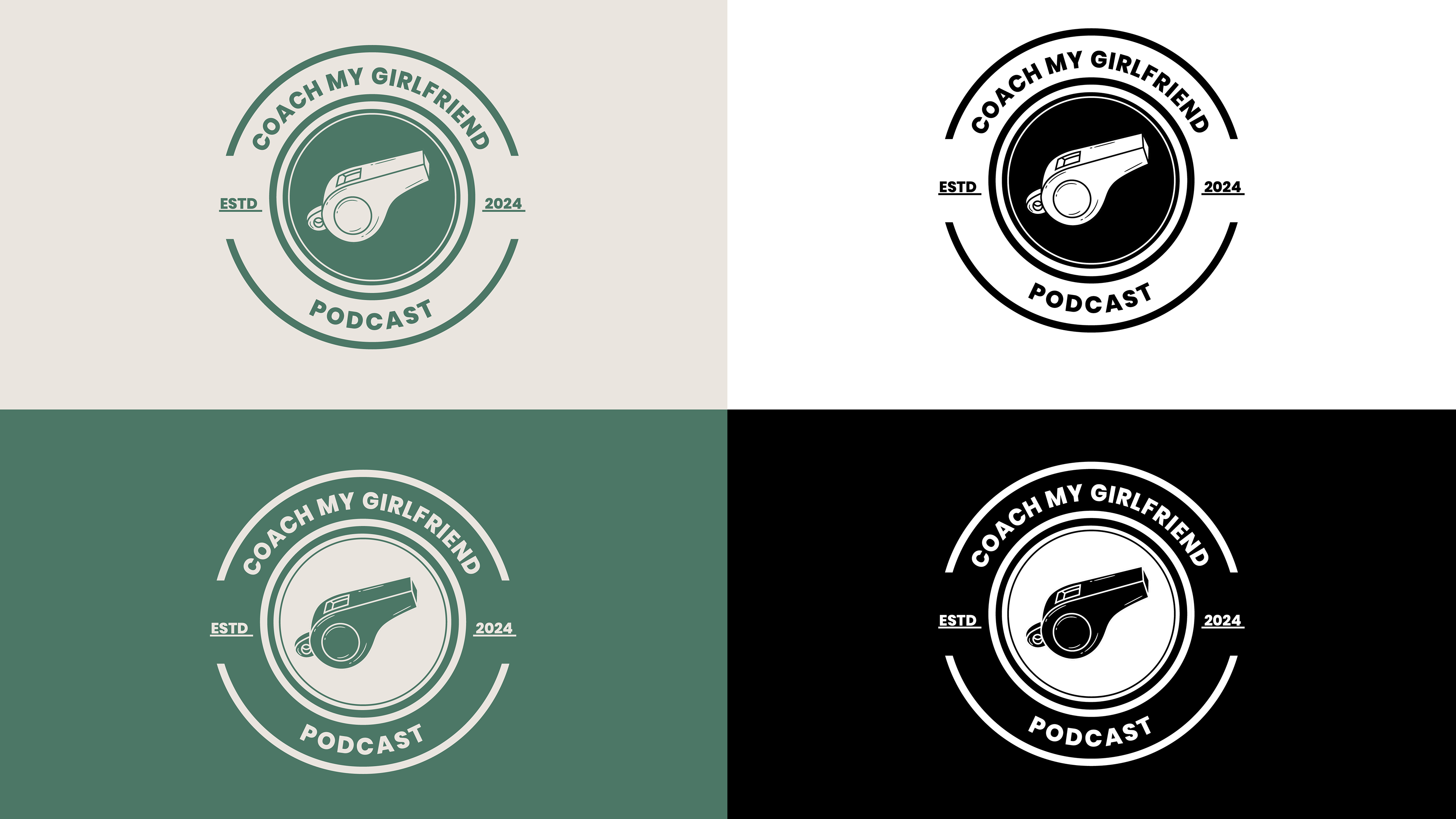
The logo combines sports elements, (The whistle) to showcase the aspect of coaching the audience about sports with a modern, minimalist typeface to appeal to the target audience. I wanted the logo to feel fresh and clean but still convey trustworthiness and expertise. The clean lines of the typeface, paired with the whistle help communicate the podcast’s theme at first glance.
The logo combines sports elements, (The whistle) to showcase the aspect of coaching the audience about sports with a modern, minimalist typeface to appeal to the target audience. I wanted the logo to feel fresh and clean but still convey trustworthiness and expertise. The clean lines of the typeface, paired with the whistle help communicate the podcast’s theme at first glance.
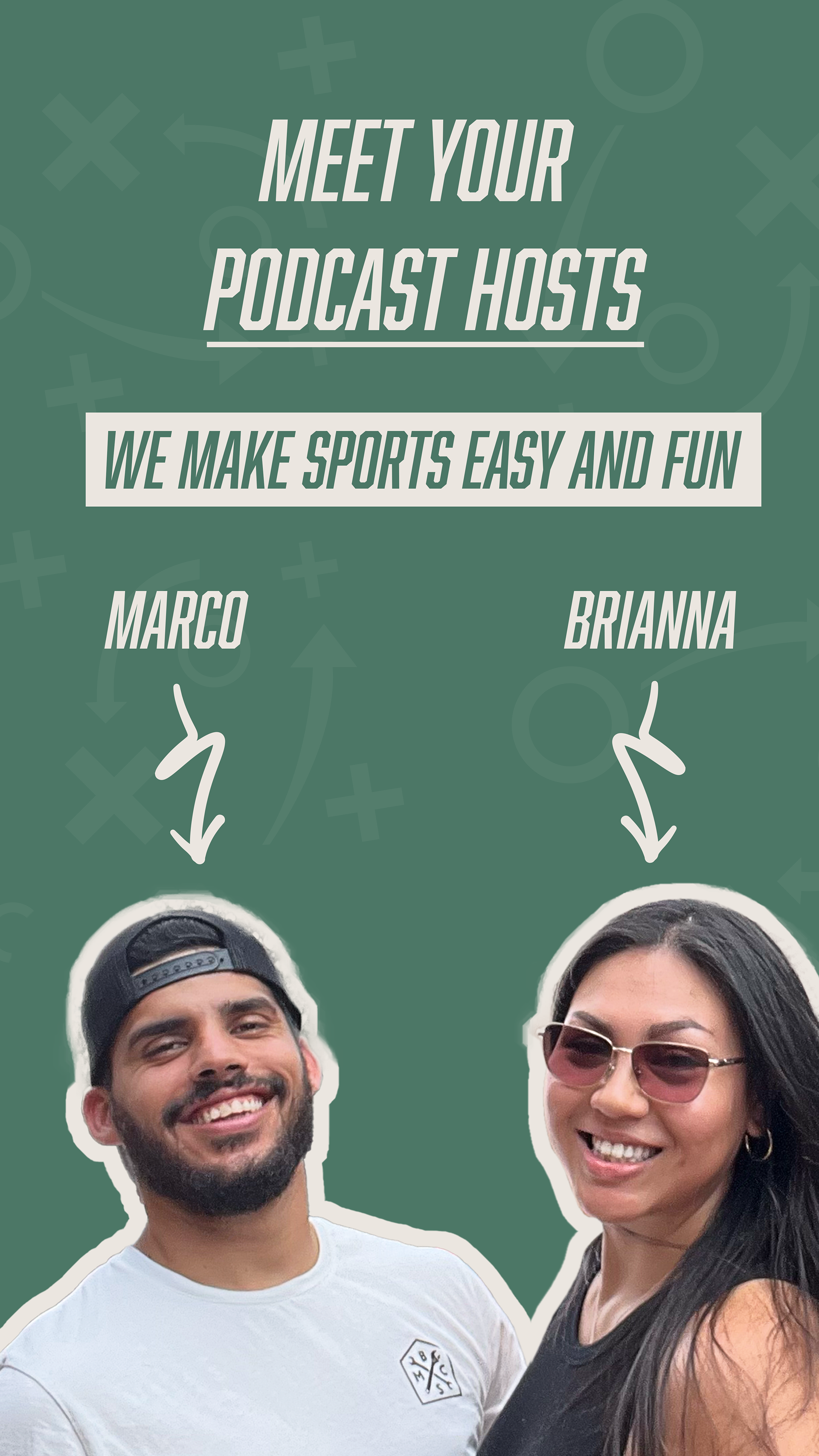
Typography
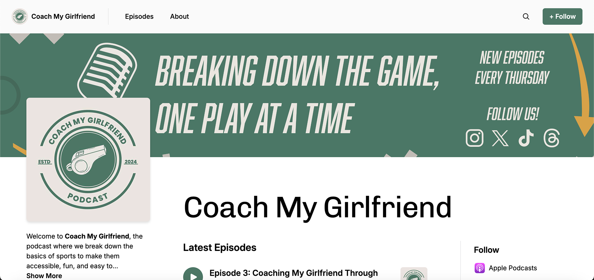
For the typography, I selected a bold, sans-serif font for the primary headers and logo to maintain legibility across digital platforms. The font’s rounded edges and simple structure create a friendly and approachable vibe while having that sports look and feel. The secondary typeface complements the primary font by providing clarity in smaller text, such as episode titles and descriptions, while still being cohesive with the overall brand.
For the typography, I selected a bold, sans-serif font for the primary headers and logo to maintain legibility across digital platforms. The font’s rounded edges and simple structure create a friendly and approachable vibe while having that sports look and feel. The secondary typeface complements the primary font by providing clarity in smaller text, such as episode titles and descriptions, while still being cohesive with the overall brand.

Color Palette
The color palette of green and beige was chosen to reflect the podcast’s sports theme while keeping it approachable. Green symbolizes energy and it's what's seen in sports fields, making it a perfect fit for the subject matter. Beige provides a warm, neutral contrast, adding balance and a sense of calm to the design. Together, these colors create a fresh, welcoming look that feels sporty without being too bold, making the podcast approachable to both beginners and sports fans alike.
The color palette of green and beige was chosen to reflect the podcast’s sports theme while keeping it approachable. Green symbolizes energy and it's what's seen in sports fields, making it a perfect fit for the subject matter. Beige provides a warm, neutral contrast, adding balance and a sense of calm to the design. Together, these colors create a fresh, welcoming look that feels sporty without being too bold, making the podcast approachable to both beginners and sports fans alike.
Social Media and Digital Presence
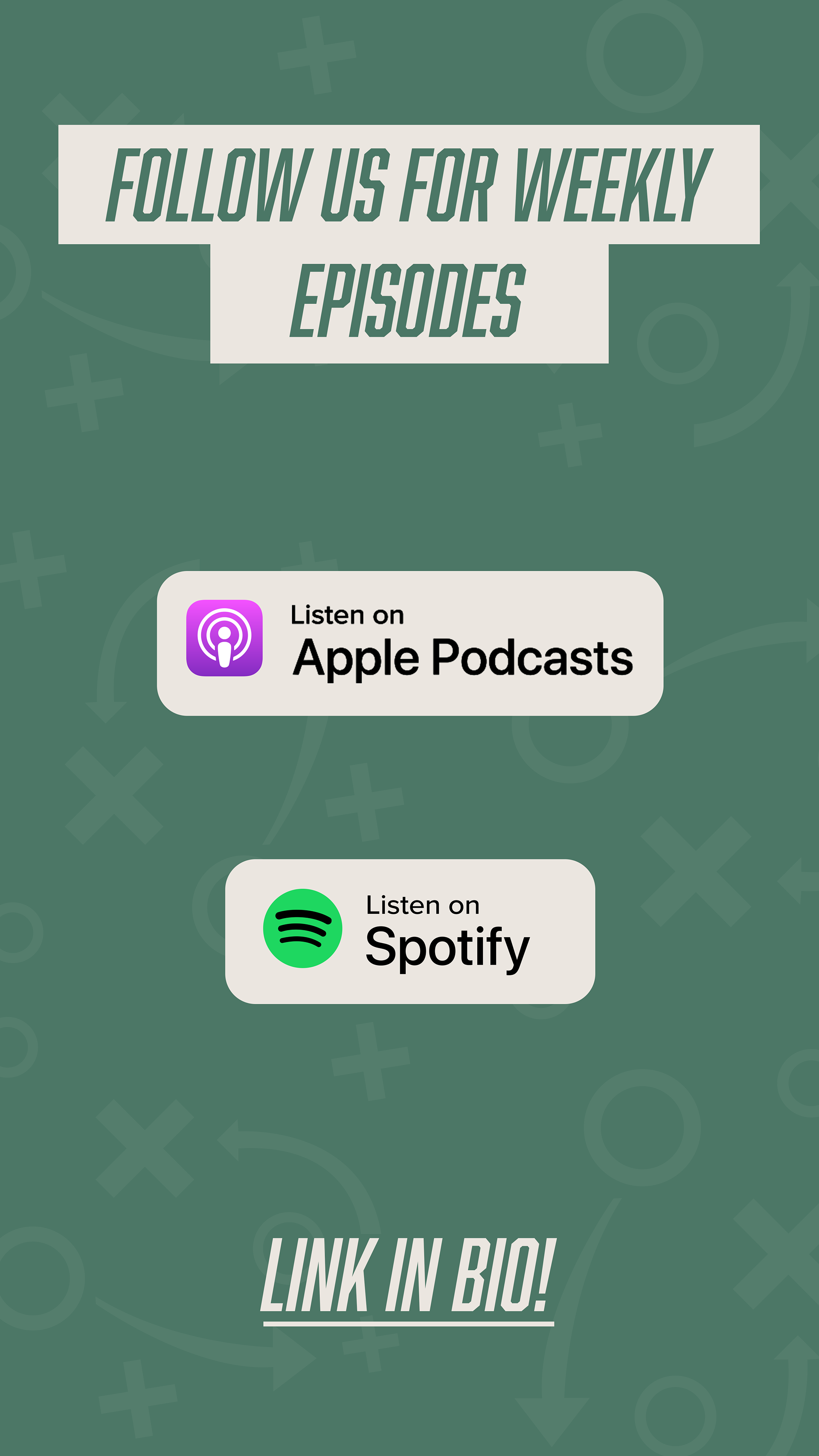
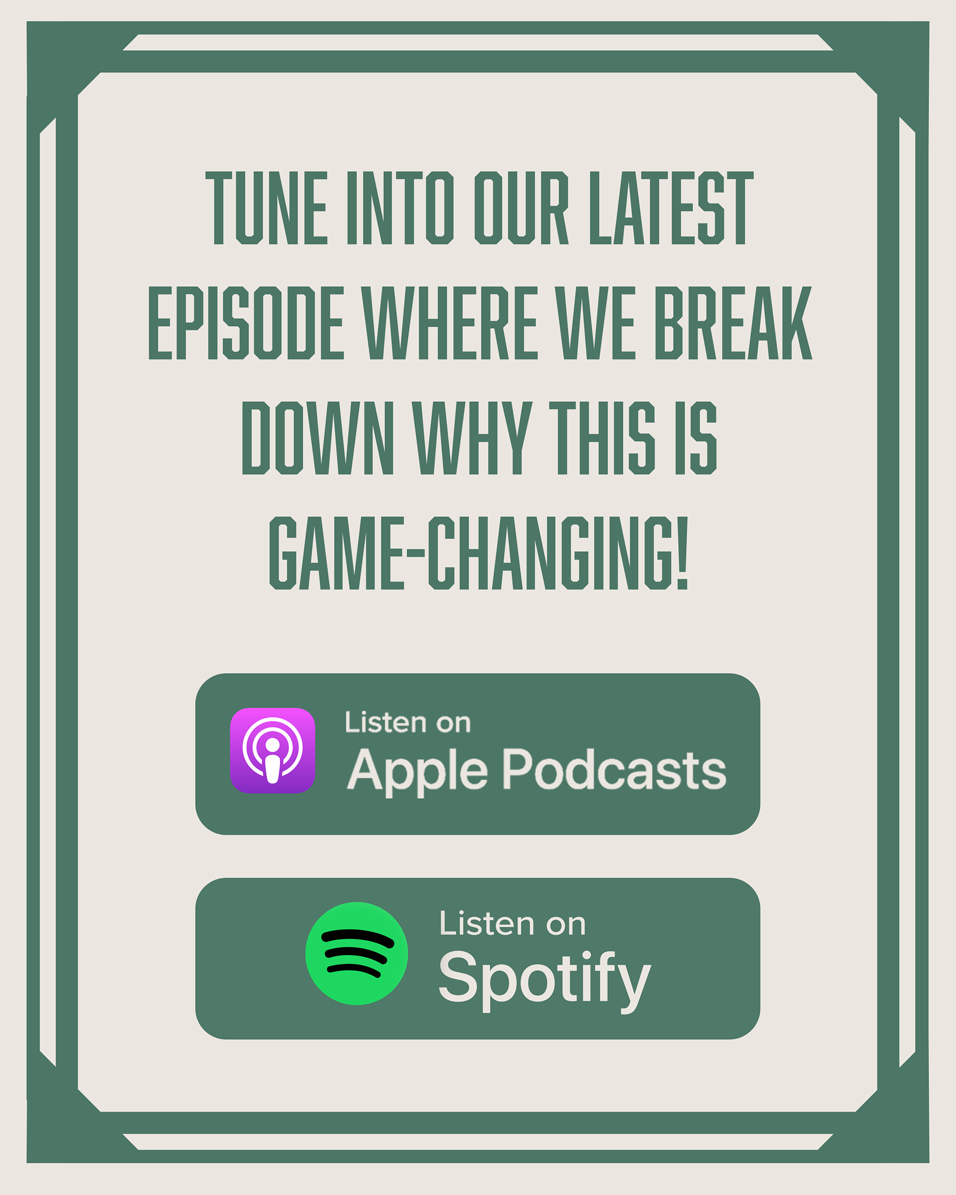
Given the digital-first nature of podcasts, I ensured that the branding translated well across all social media platforms. The visual identity is optimized for both small and large formats, whether on Instagram posts, stories, or podcast app icons. The consistency in typography, colors, and design elements ensures the brand remains recognizable in different contexts, from social media promotions to episode covers.
Given the digital-first nature of podcasts, I ensured that the branding translated well across all social media platforms. The visual identity is optimized for both small and large formats, whether on Instagram posts, stories, or podcast app icons. The consistency in typography, colors, and design elements ensures the brand remains recognizable in different contexts, from social media promotions to episode covers.